Product details
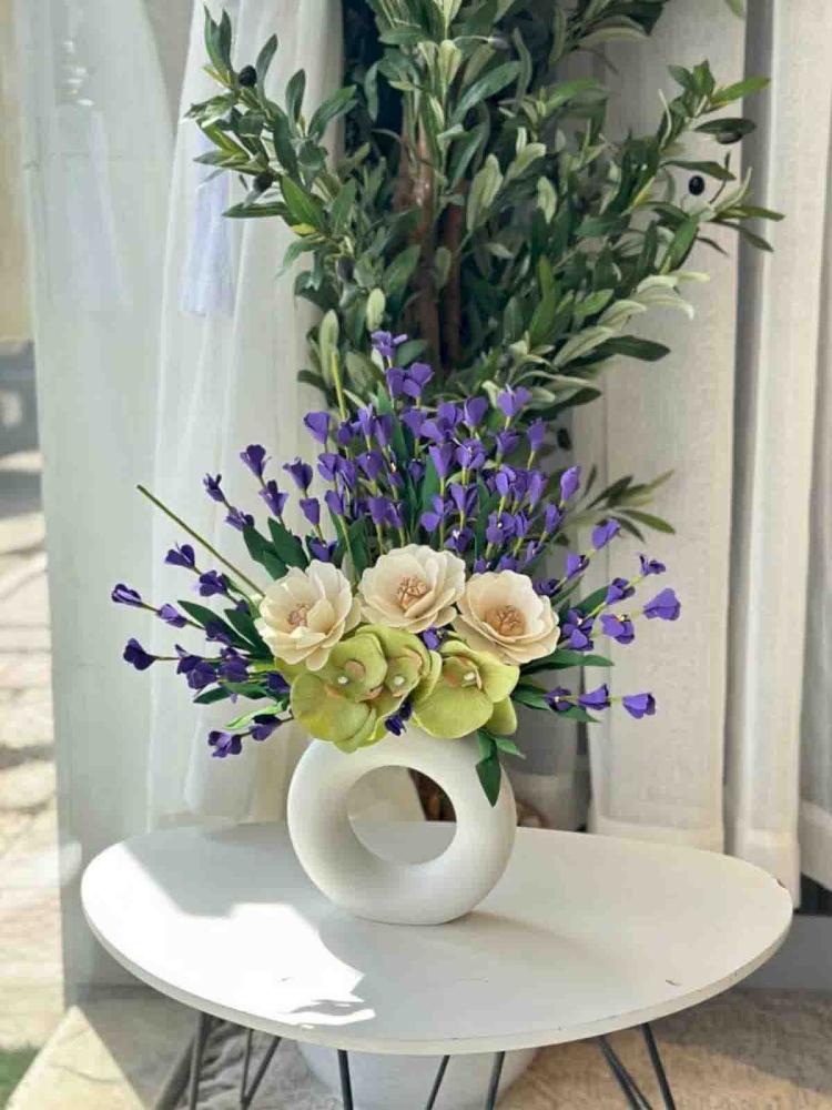
The purple and beige did not know that they were waiting for each other. When they come together in one coordination, a visual chemistry is created between them that makes the place feel as if it has been redesigned from scratch, calmness carrying depth and depth carrying calmness in a painting that makes you sit and contemplate. Details of a calm coordination in shades of purple and beige. Colors: Calm purple meets warm beige in a color dialogue that relaxes the eye and sparks the imagination. Coordination: Distributes the two colors in a way that each shows the other in a way that it would not have shown alone. Gradient: Smooth and studied, making the transition between the two colors look natural like a sunset gradient. Packaging: Reflects the calmness of the coordination and presents it as it deserves, with confident calmness. Design: Proves that the two calm colors, when they come together, create a silent visual noise. Why choose a calm coordination in shades of purple and beige? A rare dual-tone that gives the place a visual identity unlike any other coordination. Calmness carrying depth makes it suitable for those who appreciate thoughtful beauty. Suitable for spaces that want a personality that does not shout but cannot go unnoticed. Ideal occasions: Decor for upscale spaces that want a distinctive and calm visual identity. A gift for those who love earthy colors and coordination that speak in a low voice. Small party coordination for a warm and calm atmosphere at the same time. Any place that wants to be described as elegant without needing to prove it. When purple and beige are silent together, they are heard clearly. 🪻